Friday, May 25, 2012
Hi everyone! I haven't written in over a year due to the time constraints of my jobs and teaching, but I recently had the honor of writing a guest post on the American Association of Museum's Emerging Museum Professionals blog that was published today! It's about a particular textile pattern that I've been researching and am preparing to give a paper on at the Textile Society of America's "Textiles and Politics" conference this September in DC. You can find the post here. For more info, see the powerpoint and notes from my talk on the Apotheosis pieces at Dumbarton House from last year. Enjoy!
Saturday, March 12, 2011

I haven't posted in a long time, since working three part-time jobs has seemed to leave me little time for writing-- OR for visiting exhibits! Today I wanted to make note of one at the Los Angeles County Museum of Art that I really wish I could see! It will be closing in a couple of weeks and is on the opposite coast from me, so that's unlikely, but luckily they have a pretty good website here. It's called "Fashioning Fashion: European Dress in Detail, 1700-1915." While I'm not crazy about the title, the show itself should be interesting; it is displaying much of a large, recent acquisition and seems to be a sort of "survey" exhibit, without any specific narrative besides the evolution of European dress from the eighteenth through the early twentieth centuries. I find that fashion exhibits surrounding themes or ideas tend to be most compelling, but as long as the show is well-put-together it can be fun to just bask in a variety of fabulous pieces.
It seems as though this collection ranges from court dress to early haute couture to children's clothing, so it probably includes objects that are important for different reasons (craftsmanship, design quality, textile quality, historical significance, etc.). The key with a show like this is for it to be thoughtfully organized and for the didactics to clearly lead the visitor through each section so that it does not become disjointed. I have faith in LACMA-- they have a great collection and celebrated curators (Sharon Takeda and Kaye Spilker), so it is probably a wonderful exhibition.
Speaking of the curators, there is a great little interview with them here that shows what they do and how they put together an exhibit. They have my dream job! It is making me terribly nostalgic for my time at the Museum at FIT. I also like that the videos show the conservators and mannequin dressers, who are truly crucial to the exhibition and who often go overlooked.
Finally, here is a link to the cute children's game that accompanies the exhibit online. What a great idea!
Have any of you seen the exhibit? What did you think of the video? The children's game?
Tune in before too long when I report back from the Virginia Association of Museums' Annual Conference!
Image, "Mlle. Madeleine Dolley modeling a pale gray ornately embroidered and beaded (with gold) robe du bal, or ball gown made of salome silk designed by Paquin, photographed by Bert, from French periodical Les Modes," 1909, Life magazine.
Friday, September 10, 2010
Summer recap and last chance to see "Art by the Yard" at the Textile Museum
Photo of myself and a friend at the Mod Madness event, checking out some Lucienne Day tea towels. Photo courtesy of the Textile Museum.Some of this summer's most interesting textile events have surrounded an exhibit at the Textile Museum on S Street in Washington, D.C. called "Art by the Yard: Women Design Mid-Century Britain." The exhibit closes this Sunday, September 12th, so if you have not yet been to see it I highly recommend that you go! The show focuses on textile designs by Lucienne Day, a pioneering British textile designer in the mid-century Modern style. Beginning with her groundbreakingly abstract "Calyx," the galleries showcase her imaginative, appealing, and sometimes humorous designs with ample yardage. I particularly like the back gallery, which has a room featuring textiles in situ with furniture designed by her equally famous husband, Robin Day and also shows some of her delightful tea towels. Too bad the repros cost such a fortune in the gift shop! The final room also includes the work of two of Mrs. Day's contemporaries, Jacqueline Groag and Marian Mahler.
My only complaint with the exhibit was that I felt there was far too much text-- many of the didactics elicited the dreaded TLDR (too long, didn't read) response, even from me (and I am a big reader of didactics). Still, the pieces were extraordinary, the exhibit arrangement flowed well, and the mounts were fantastic as always (with a salute to my friends in the conservation lab, Anne Ennes and Esther Methe).
The first event I attended this summer that was associated with the exhibit was a lecture by the esteemed Titi Halle, director of Cora Ginsburg LLC (possibly the best dealer of historic costumes and textiles in the country). Her talk, entitled "Cutting Edge: Textile Artists of the 20th Century," was a primer on 20th-century textile design from Raoul Dufy's work for Paul Poiret to the Bauhaus and the Weiner Werkstatte to designers of the fifties and sixties, including Mrs. Day and showed some wonderful images of examples from the Cora Ginsburg collection. It was a great refresher for me and a good basic introduction to the subject for anyone interested.
The second event I attended that was linked to the exhibit was purely for fun-- it was an evening event called "Mod Madness" that linked the mid-century theme of the exhibit to the popular fixation with Mad Men and included a bar, food for sale, a DJ and jazz combo, a silkscreen-your-own T-shirt station, and a "best mid-century dressed" contest (I was a runner-up but not a winner... next time!) It was very heavily attended, by professionals, hipsters, and museum dorks (that's my category) young and older (mostly women, but that seems to be the usual situation with museums!). Tickets were only $10 and included one ticket for a non-premium drink. A great time was had by all and I think it was a great event for the TM, although I have not heard any details from their staff. Hope to see more like it! I have noticed that young professionals are the new hot market for museums, so I expect there will be many such events in the future.
Enjoy the exhibit at the TM this weekend- and remember, they're open 10-5 on Saturday and 1-5 on Sunday and have a suggested donation of $5 (but pay what you can/want).
Did you attend either of these events? Any other great textile or museum-related events this summer? Did you enjoy this exhibit?
Monday, May 10, 2010
Review: American Woman at the Met

The Met now has a great feature where you can access the collections database records (including images) for all the pieces shown in the exhibition from their website, here (the second link). While it's out of order, it's a good virtual visit to the show!
This weekend's museum visits were very fruitful! We went to American Woman first thing, so we were not swamped by other visitors (although the Picasso exhibit was packed to the gills). Overall, I was very happy with the show. It was extremely different from The Model as Muse in many ways. Model as Muse was a highly academic show, with a lot of text and a lot of garments. I really felt that it contributed to the scholarship of the field-- read my full review here. American Woman at least seemed to be a much smaller exhibit, with fewer garments overall, and much, much less text. Outside of an introductory didactic and an approximately 200-word didactic for each room, there was no instructional text, just "tombstone" labels for each garment. Any additional information was included in the audio guide, which I got just to see how it was. Thankfully, Sarah Jessica Parker's narration was not distracting-- it just sounded like she was reading an audiobook. I'm assuming curator Andrew Bolton wrote the audio guide text, but I didn't see any credits for its author anywhere. The audio guide was pretty nice-- not particularly deep, but offering additional insights and notes on the pieces, and drawing particular attention to certain objects. I wasn't left wondering about the objects, and it was obvious how they all fit into the particular archetype demonstrated in each room (as a reminder, the archetypes were The Heiress, The Gibson Girl, The Bohemian, The Suffragist, The Patriot, The Flapper, and The Screen Siren).
I did want to know more about some of the accessories, including shoes and hats, most of which were not identified. It's possible that they came from the museum's prop collection, of antique but not particularly valuable pieces that are used for display purposes but not accessioned into the permanent collection. Something that totally stymied me was the presence of at least three Fortuny pleated "Delphos" dresses in the Bohemian section that were entirely ignored by the text. They were worn underneath wrappers, by Liberty of London for the most part, which were credited in the labels. The Fortuny tea gown/evening dress, both historicizing and strikingly modern and meant to be worn over an uncorseted body in a time when corsets were generally worn by all proper ladies, would have fit perfectly into the discussion of The Bohemian. It's possible that the Fortunys shown were reproductions, but I doubt that, considering that the Met has at least ten Delphos dresses and that the luminosity and uniqueness of the gowns' colors were characteristic of true Fortuny pieces. My only other guess is that the Fortuny gowns were from the Met's own collection, and as they wanted to feature only pieces that had come from the Brooklyn collection, they didn't mention them. I'm stumped!
The set design (by Nathan Crowley, a Hollywood Production Designer for films such as The Dark Knight) was unbelievable. Each room was painted in an appropriate backdrop for the archetype (for instance, the Heiress section had curved walls-- like most of the rooms-- and was painted to look like Mrs. Astor's ballroom in Newport). As in Model as Muse, some of the sets incorporated pieces from the Met's Decorative Arts collection, such as chairs and chandeliers. I think this is a great idea and assists both in appreciating the garments somewhat in situ and getting a chance to view pieces that might otherwise be stuck in storage. It is a real treat that they have the resources to create such elaborate sets! My only complaint with each room was that the lighting made it very difficult to see some aspects of the costumes. I'm not talking about the overall light levels; although they were low, that is necessary to preserve the pieces. It's that the lighting was spotty, with patches of dark and light, so that there was a subtle mottling to the illumination. This made it hard for me to discern details on some pieces-- although it may have been intentional, as low lighting hides a multitude of problems in damaged or fading garments!
I felt that the sections on The Suffragist and The Patriot, put together in one room, were sadly lacking. The Suffragist section featured about three or four suits from the teens, accessorized with a suffragette banner and some sashes-- not much of a sartorial statement. The Patriot section featured only two ensembles, both of them uniforms. These are interesting pieces and great early examples of women's military service-- but even combined with the Suffragist suits and the large screens showing contemporary video footage, I didn't feel that they really filled their own section. I also don't feel as though these are particularly strong American female archetypes (and I feel somewhat the same way about The Bohemian), although I understand that their depiction of strong, independent working women fits in well with the overarching ideas of American female identity that Bolton is getting at.
The Flapper, and her taboo-breaking sexual and behavioral freedom, is perhaps the best known of the archetypes and certainly had the fullest exhibit room. There were a couple of nice day ensembles, highlighted as appropriate for the career woman (read: working class person) that the Flapper typically was, although I didn't really think they were appropriate work clothes-- more like sportswear. The evening dresses were stunning. This was one room in which Julien d'Ys' hair dressings were NOT distracting-- in others, they were very irritating, particularly in The Heiress and The Gibson Girl, where the pompadours were multiple feet high and wide. I understand wanting to stylize, but I felt that in many cases it took away from the display of the objects.
The exhibit ended with The Screen Siren, which featured some video footage and a number of slinky '30s gowns. I was expecting to see more American designs in this section-- Adrian, perhaps, or some more American film designers. There was a notable piece by Travis Banton, but it was a film costume, and while striking, I wasn't certain it really fit in since it wasn't really "fashion." The other thing that irked me about this section was something that I saw in a few other places in the exhibit: less-than-stellar mannequin dressing. Many of the mannequins were dressed extremely well, but a few caught my eye in a bad way-- a Worth gown or two from The Heiress didn't have smooth, filled-out torsos, and there was a cluster of James gowns in The Screen Siren that made me shudder. James gowns are particularly difficult to dress because they are so sculptural. These gowns were not the most architectural of his pieces-- they were examples of the "Sirene" gown (aka the shrimp dress, see here)-- but they are still meant to fit exceptionally well and, as they are all custom-made, require appropriate mannequin modifications to look right. These appeared as though they had just been placed on the mannequins, which I'm sure is not true, but they were ill-fitting and gapped in a number of places, and I thought it made it difficult to really appreciate their intended look. Perhaps I am biased because FIT has custom mounts for all their James gowns-- but I think that is really the appropriate way to display them. See the difference here.
There is one more point I want to mention. I will not go into detail about Robin Givhan's review of this exhibit, a) because this post is already epic and b) because I don't want my blog to turn into a collection of reviews of Robin Givhan articles, BUT in her review (here), she says, "...based on this exhibition, the beauty ideal has always been slender. Those athletic Gibson Girls were practically waifs. The Flappers -- at least the ones who naturally fit the clothes and did not have to bind their bosoms so they would be fashionably flat -- were small-boned and almost fragile. Even the Screen Sirens, celebrated for their womanly curves, are tiny compared to a contemporary actress.... In our upset with the present, we have re-imagined a past of buxom beauties that mostly did not exist."
She is both right and wrong. While the ideal body of the American female archetypes discussed in the exhibit has frequently been fit and athletic, it is not true that "buxom beauties" were never actual ideal body tpes of the past. The Heiress, while fragile, was probably able to be heavier than today's models thanks to the aid of her corset. The Gibson girl was seen as tall and healthy, if still svelte. The Bohemian, Suffragist and Patriot had some more room to fit in their dresses-- they were ideally busty and shaped like an inverse teardrop, wearing empire-waisted dresses and peg-top skirts. Flappers were boyish and frequently thin, although the emphasis was on a lack of definition of curves and not necessarily on waifishness. The Screen Siren ideal is perhaps the most difficult to fit-- tall and thin but just curvy enough to make a bias-cut dress interesting. The thing is, the pin-up girl of the 40s was certainly voluptuous-- and what about Marilyn Monroe? "Buxom beauties" existed-- just outside of the 1890-1940 time frame.
That aside, Givhan's point is that the ideal bodies seen in the exhibit were no fairer to the everyday woman than is the oft-discussed stick-thin ideal of today. That is true. Fashion isn't fair-- fashion just likes novelty. Ideal bodies will come and go, but if they get any healthier it will not be because fashion has decided that that's the best thing for everybody-- it will be because we're bored.
The final room in the exhibit was an oval with video and still photo projections of well-known "American women," from Katharine Hepburn to Michelle Obama. There was a particularly fabulous juxtaposition of Josephine Baker in her banana skirt with Beyoncé in her "Single Ladies" video. I felt it helped challenge the visitor to think about the characteristics of today's American woman. It also fit well with the concluding didactic, which emphasized that while these archetypes never represented a majority of real women at any point, they all combine to help name the characteristics we associate with American womanhood: vitality, boldness, and sexual, social, and artistic freedom. While I am not sure that this was a significant contribution to research in the field, it was a digestible exhibit that will teach its visitors some interesting social and fashion history and perhaps leave them with the sense it left me-- that American women are, above all, independent.
What did you think of the exhibit? What were your favorite pieces? What thoughts did you depart with?
Photo: Actresses Marlene Dietrich and Anna May Wong w. filmmaker Leni Riefenstahl at Pierre Ball, Berlin, Alfred Eisenstaedt, Life, 1928.
Thursday, May 6, 2010
American Woman Hype

I'm very excited to see "American Woman" at the Met and "Night & Day" at FIT this weekend, although I'm a little apprehensive about the crowds at the former-- and not only because it's opening weekend. This exhibit has received more hype than any other fashion exhibition I've seen in a long time! Last week's Costume Institute Benefit Gala, frequently called "the party of the year," had (as always) a huge celebrity draw and was co-hosted by none other than Oprah, along with Vogue editor-in-chief Anna Wintour (who co-hosts the party every year) and Gap's Executive VP for Global Design, Patrick Robinson. According to the exhibit's press release, the Gala is "The Costume Institute's main source of annual funding for exhibitions, operations, and capital improvements." Most curators I know would happily give up an appendage for a source of funding and publicity like that! Since the party's red carpet shots are shown on news, fashion, and society pages everywhere, the public is more aware of The Costume Institute than usual these days, which draws attention to the new exhibit.
In addition, "American Woman" is being sponsored by Gap, who has released a line of embellished t-shirts inspired by each archetype explored by the exhibit (the heiress, the Gibson Girl, the haute bohemian, the suffragist, the patriot, the flapper, and the screen siren). While the t-shirts are cute enough, I personally find them overpriced for how simple they are. I think the suffragist is my favorite, or perhaps the screen siren-- but I'd be much more likely to consider investing if they were $15 or $20 cheaper.
As if that weren't enough, Gap has also coupled with designers Alexander Wang, Rodarte, Sophie Theallet, and Thakoon to create unique gowns that were worn to the Gala by Vera Farmiga, M.I.A., Kirsten Dunst, Kerry Washington, Jessica Alba, Riley Keogh, Zoe Kravitz, and Jamie Bochert (all this comes from the Gap website). The gowns, now displayed in a Gap pop-up store on Fifth and 54th, are being sold in an online silent auction, with the proceeds benefiting the Costume Institute. Bidding opened yesterday and will last until May 31st.
Goodness gracious, what a lot of publicity for a show! Something about it turns me off, although I should, of course, be happy that a fashion exhibit is getting this much attention. I think that between this and Sarah Jessica Parker's narration of the audio guide, I am afraid it's going to be too fluffy and commercial. I had some of the same worries, however, for "The Model as Muse," and I was stunned by how academic and thorough it was. And, as the Gap was founded in 1969, I don't have the same fears about conflict of interest in content as I would if it were, say, a monographic show being sponsored by the living designer whom it was featuring.
I am ready to plunge in and see how the exhibit is!
Has anyone seen it yet? Did you like it? Do you think it will be too fluffy or will it satisfy pop-culture lovers and museum dorks like me alike?
Image by Charles Dana Gibson, undated (c.1903, I think), from the Time/Life image archive
Monday, April 26, 2010
Upcoming Exhibitions: "American Woman" and "Night & Day"

My trips to Manhattan for exhibits are much too few and far between, and when I go, I have to pack in as much as I can. In a couple of weeks, I plan on visiting the shows "American Woman: Fashioning a National Identity" and "Night and Day" at the Metropolitan Museum of Art and The Museum at FIT, respectively. "American Woman" features garments from the Brooklyn Museum Costume Collection, now housed at the Met (I discussed the transfer here), and will focus on changing perceptions of American femininity in and through dress. This could be a broad and thought-provoking exhibition because it is not only examining the work of American designers but all designers who dress, and have dressed, archetypal American women. I'm also excited to see it because I have spent a large amount of time discussing American designers and the American market (and their differences from their French and European counterparts) in the course on the great designers that I taught at Marymount this semester. When I met the wonderful Isabel and Ruben Toledo last week (more on that later, once I get pictures!), Ruben laughingly commented to me that he thought it was funny that Andrew Bolton was curating this show, since he is British! But perhaps an "outsider" can more easily recognize those things that are archetypically American. One thing that rubs me the wrong way is that the sample Audio Guide clip on the exhibit website is narrated by Sarah Jessica Parker, but perhaps that has more to do with my views on Sex and the City (which I will keep to myself-- you're welcome) than any hints at "selling out." If costume exhibits were completely divorced from pop culture, I don't know if anyone but me would come, anyway!
The second exhibit, "Night and Day," is a rotation of The Museum at FIT's History Gallery, which is always a chronological display of fashion history from the 18th through the 21st centuries but features different garments and a different theme every 6 months. This one focuses on the rules for appropriate dress according to time of day. I'm particularly curious to see what they come up with for the late 20th and early 21st century, as we no longer have hard-and-fast rules as to what must be worn when. Perhaps there will be some pieces that blur the day/evening line. I'm sorry that I will be catching this exhibit at its tail end. If you have the chance, go now before it's too late!
Has anyone been to "Night and Day?" How about FIT's show "American Beauty," which recently closed but was focused solely on American designers, many of whom are not well known? Are you as excited to see these exhibits as I am?
Photo by Alfred Eisenstaedt, Life, 1941.
Friday, April 9, 2010
Japanese Fashion and Textiles; Isabel and Ruben Toledo at Marymount
I finally made it to the Textile Museum to see "Contemporary Japanese Fashion: The Mary Baskett Collection," which closes on Sunday (I mentioned it here on the blog before it opened). The exhibit is excellent for many reasons, and if you have the chance to see it this weekend, by all means go.For a costume exhibit-- or any exhibit, really-- to be successful, it needs to be both scholarly and engaging, which to me means 1) readable didactics and labels, 2) a layout that displays the objects to their best advantage while protecting them from damage and allows for easy viewing and movement within the space and 3) a coherent and digestible "big idea" or takeaway message. This exhibit did quite well on all of these fronts, although I had a few minor complaints.
While at first glance I considered the didactics too long (I prefer 150-200 words or fewer), I found them both concise and informative. There were only four didactic panels: an introductory one that explained the designers featured and the collector of their pieces, and one for each of the featured designers (Yohji Yamamoto, Issey Miyake, and Rei Kawakubo). The label copy was not displayed; instead, it was featured in spiral-bound books that could be taken at the start of the exhibit, and each ensemble was numbered at the base of its mannequin or mount for reference in the catalog. I suppose they chose to do this in order to make the exhibit space as clean as possible, and not clutter it with labels, which are often difficult to place. Still, I had to go back and get the book because I didn't realize it was a necessity at first, and I feel as though many museumgoers would have missed it altogether and simply wandered through the space guided only by the larger didactic panels on the designers. Because of the unorthodox features and enigmatic style of these garments, as well as their connections to the design philosophies of their makers, labels were absolutely necessary in this exhibit and anyone who missed the label copy probably felt more confused than enlightened. My one other gripe with the labels was that some of the objects that seemed the most intriguing were left unexplained (an ensemble on a strangely posed mannequin by Kawakubo, and a shorts suit by Miyake, for example). Otherwise, I felt that the didactics and labels were quite well-written.
Besides the clothing itself, the most striking element of the exhibit for me was the way in which the garments were mounted. Most of them had custom interior mounts that were attached to the ceiling and floor by long wires, which allowed the pieces to take their proper shape as though being worn but also to speak for themselves, uninterrupted by distracting mannequins. My guess is that these mounts were provided by the owner, at least in part-- while the exhibit was sponsored (by the cosmetics company Shisheido, among other organizations), the production and installation of custom mounts for all of these pieces seems as though it would be prohibitive both in time and in cost. There were other pieces mounted on simple, appropriate mannequins, and a few pieces mounted flat or on custom-carved foam mounts. One piece was shown quasi-flat, so that the pattern could be appreciated, but with a subtle body shape in the foam support that suggested its look when worn. I was very impressed by the quality of the mounting in this exhibit, and few things are more important to costume exhibits than proper display!
The exhibit also had irregularly angled white wooden "floors" built up underneath the garments, which served as a kind of "set" and also prevented visitors from walking too close to, or underneath, the pieces on display. While I am certain these were labor-intensive and time-consuming to produce, the result was excellent-- it was just the kind of subtle backdrop that best accents these types of garments and eliminated the need for unsightly stanchions or guardrails.
Finally, one of the smartest things about the exhibit's arrangement was that it began with work by Yohji Yamamoto, continued with Issey Miyake, and finished with Rei Kawakubo (and some of her colleagues at Comme des Garçons). At first, I was suprised that the show did not begin with Mikaye, who is the oldest of the three and considered the field's pioneer. Starting with Yamamoto, however, both made best use of the space (the exhibit starts in a smallish hallway that would not have had room for all of the Miyake pieces) and made conceptual sense. Yamamoto's pieces are the easiest for Westerners to understand; they blend Western and Japanese fashion sensibilities and are the most "wearable." Miyake's are fun and innovative, and a little more difficult to accept aesthetically, and Kawakubo's are the most intellectual and least "beautiful" in a traditional Western sense. By beginning with Yamamoto and ending with Kawakubo, the visitor is introduced to foreign concepts bit-by-bit, and is warmed up by the time he or she reaches the most challenging garments.
While I would have liked to learn a bit more about the Japanese concept of wabi-sabi (beauty in imperfection and transience) that was hinted at, but not named, in the didactics, I felt that the exhibit did an excellent job of introducing both the layman and the fashion scholar to pieces that are at once unfamiliar and important. I appreciated that the didactics emphasized that the collector wears these pieces in her everyday life, showing that the designers are not creating these objects as pure art but as clothing to be worn.
There is much more to say about these designers and why they are so important to contemporary fashion but I will save that for another day. I want to end by saying that Marymount University (where I teach) is soon holding its annual Portfolio in Motion event, where fashion design and fashion merchandising students produce a fashion show and host a eminent designer, who receives an award and reviews the portfolios of the senior design students. I blogged about last year's event and featured designer Peter Som here. This year, the event takes place starting Thursday, April 22nd and continues into the weekend, and our featured designer is none other than Isabel Toledo, who designed Michelle Obama's "Lemongrass" ensemble for the inauguration and an exhibit of whose work I thoroughly enjoyed last year. She will be accompanied by her husband, celebrated illustrator Ruben Toledo. I am beyond excited about their attendance, both for my own sake and for the students'. Tickets for the opening show and cocktail reception are $100, but you can attend the subsequent shows (without the Toledos) for only $15. More information can be found here.
What do you think of these designers? Have you seen the exhibit, and how did you feel about it if you did? What do you think is most important in an exhibit like this?
Photo by Mark Whiting, http://picasaweb.google.com/lh/photo/0MYZE3-pdqbyw0fG7Kqb2Q
Thursday, February 11, 2010
Katie Couric in Harper's Bazaar

I have finally returned from a far-too-long hiatus centered around a trip to Southeast Asia and the subsequent readjustment to normal life, which itself was interrupted by unprecedented snowstorms that have shut down the entire Washington area! Now, however, I'm back, and while my first intention is to write a post on the fabulous textiles I encountered in SE Asia, I've decided to begin instead with a brief post on an article by The Washington Post's Robin Givhan. The article focuses on a story in this month's Harper's Bazaar about CBS anchor (and UVa alumna, I might add) Katie Couric.
I have covered Givhan's reporting in the past (see these posts), and generally admire her writing and obersvation, although I feel that her lack of a fashion studies background is a handicap to her full understanding of some of the topics she covered. The article on Couric centers not on the text of the Bazaar article but on its photography, by François Dischinger. Givhan writes, "(The photos) are an audacious celebration of a powerful woman as a boldly sexy one, too.
There's nothing reserved or hesitant in the sex appeal on display in the four-page story about Couric. The images are a full-throated, even exaggerated, rebuke of the notion that a woman must dress in a prescribed manner -- Suze Orman suits, full-coverage blouses, sensible heels -- to protect her IQ, her résumé and her place in a male-dominated work culture.
Is Couric dressed in a manner appropriate for a network anchor? These images demand that viewers define -- or redefine -- their terms."
There are two main images of Couric that accompany the article (at least in the online coverage): one depicts her in a beige, one-shouldered, above-knee-length Calvin Klein collection dress sitting at a glass desk in a modernist white office, and the other shows her in a short, dark skirt and blazer by Giorgio Armani, black hose, and a pair of Louboutin booties. She clutches the blazer closed at her chest and no shirt is visible underneath. In this second picture, Couric stands boldly atop two TV sets, one showing her (in?)famous interview with Sarah Palin and one showing her interviewing President Obama.
It's obvious that the photographer wanted to convey confidence, power, and yes, sex appeal. Couric is, after all, the first woman to anchor the evening news solo on one of the "big three" broadcast networks. While the article seems to emphasize her interviewing prowess, she is portayed as the anti-Barbara Walters: young, modern, in-charge -- and sexy.
In fact, it seems as though leaving sex appeal out of the picture would diminish her powerful image. In our culture, sex appeal has become an essential part of a woman's strength; asexuality, dowdiness, or even the downplay of one's assets for the sake of propriety smacks of a lack of confidence and creates the sense that a woman is not at home with her femininity. This is not a particularly new idea, especially since Sex and the City brought almost-nymphomaniacally sexually aware third-wave/post-third-wave feminism to the forefront of popular culture.
Givhan takes this sex-appeal-as-power in a different direction, as well, recognizing the difficulties of maintaining this kind of fashionable image (particularly when it comes to shoes):
How can she walk in those? Pure grit-- that's the explanation. And yes, please infer that if those four-inch stilettos don't draw tears from the woman wearing them, then neither will some ambitious colleague's backstabbing ways. Fashion, in this sense, is power.
There is, of course, the depth of the phallic symbolism of high heels to be plumbed here as well, but plenty of articles have already been written on that subject. And, to be honest, I don't think that would be particularly pertinent in an examination of Katie Couric.
As Bazaar fashion/special projects director Laura Borwn phrases it, "When coming up in the industry, you tend to dress the way people think you should dress. (Couric) has earned the right to be sexy if she wants." In these photos, Couric is indeed participating in the dissemination of this idea. Yet Brown adds that, after all, Couric was "doing photos for a fashion magazine, not Newsweek." I think that any analysis of Couric in these photos, and not just the photos themselves, must acknowledge that Couric's participation here was mostly as a fashion model. These are not news photos, nor are they strictly fashion journalism; they are that frequently seen combination of portrait and fashion shoot that combines chosen aspects of a person's personality and appearance with other desirable attributes to create a celebrity image.
Givhan states, "Certainly, some will see the pictures as further proof of why she is all wrong for the job. They will probably be the same people for whom Couric has accumulated a personal work wardrobe of blacks, grays and pinstripes -- a more sophisticated, yet still reserved, alternative to the news-anchor cliché of Crayola-colored blazers." These people, and perhaps Givhan as well, would do better to analyze Couric's personality, and personal image, through the clothing she wears on and off the job in public life. Those "blacks, grays and pinstripes" are far more telling about the real Couric, and her personal idea of what it means to be a powerful woman, than the outfits in which she was dressed by the Bazaar staff. How does sexuality play into this? Only a good look at Couric's wardrobe choices, which deserves more thought that I can give it here, would tell.
What do you think? How do you perceive Couric? How do you think our culture interprets sexuality and its relationship to feminine power?
Photo of Couric by Sylvain Gaboury for Life, 09 Mar 2000.
Thursday, December 17, 2009
An Audrey Hepburn Auction, Louboutins, and Jennifer Lopez

On December 8, Kerry Taylor Auctions, an antique and vintage fashion and textile auction house out of London, held its "Passion for Fashion" sale, including items from the estates of Audrey Hepburn and 70s supermodel Marie Helvin. There were also touring exhibitions of highlights from the Audrey Hepburn collection, in New York and Paris in late November and early December.
Having worked for Augusta Auctions, a comparable American auction house, in the past, I am particularly interested in these items (and their sale prices)! Hepburn was Hubert de Givenchy's muse, so there are understandably a large amount of Givenchy pieces in the sale. There are also a number of earlier pieces, including some early Fortuny and Paquin pieces. Images and descriptions of the lots are available here and the final hammer prices are here. The two highest prices I could find were 20,000 and 50,000 pounds for lots 98 and 293, respectively.
Lot 98 (here) is a stunning Chanel couture cocktail dress from the 1920s made of over-printed lace (where the colors are printed over the floral design on the lace itself). It is listed as in "fine" condition, and this particular kind of lace in Chanels' work is rare. 20,000 is nearly four times the upper estimate of 4400 pounds, which means two people probably wanted this dress very much! I wonder if the Costume Institute at the Met and/or Cora Ginsburg in New York were represented at the sale.
Lot 293 (here) is a Givenchy couture cocktail dress and jacket in black chantilly lace, worn by Hepburn in "How to Steal a Million" (1966). Its 50,000 pound hammer price was over twice its upper estimate. Although a beautiful example of Givenchy's work, it seems as though most of the significace of this piece lies in its connection with the film; therefore, I suspect it was bought by a collector and not a museum (although I could be wrong).
On a sillier note, last night Jennifer Lopez performed her song "Louboutins" on the season finale of So You Think You Can Dance. The routine opened with Lopez (wearing silver or nude Louboutins-- it was hard to tell) on a bed attached to a giant shoe with a red sole. She calls Santa on the phone and asks him for a pair of Louboutins-- "you know, the ones with the high heels and the red bottoms." The song is about leaving a "part-time lover," and the chorus is a repetition of the phrase "I'm throwin' on my Louboutins, I'm throwin' on my Louboutins." While I personally think the song is pretty silly, this is a HUGE popular culture appearance for Loubs. They're quite well-known, for sure, but not only does Lopez use the designer's name as the title for her song and repeats it ad nauseum in the chorus, this performance (on the season finale of a show with an enormous viewership) is also supposed to mark her return to performance after a hiatus of about two years. The focus on Loubs is, as usual, about lifestyle and not quality or even appearance. The character in the song isn't "throwin' on her Louboutins" to go out and look sexy, she's putting them on to walk out the door on her lover (others might choose running shoes). I focus on Louboutins relatively frequently, so I'll not overanalyze all this, but I consider it a big step in the apotheosis of the Louboutin shoe as symbol of conspicuous consumption and glamourous lifestyle.
What do you think? Do you like the song and/or the performance? How do you feel about what this says about Louboutins?
Image of Audrey Hepburn holding her Roman Holiday Oscar by Ralph Morse for Life, 1954.
Tuesday, November 24, 2009
Report from Boston: Fashion and Popular Culture

A few weeks ago I attended the Mid-Atlantic Popular and American Culture Association (MAPACA) conference in Boston to give a paper on The Jetsons and Space-Age fashion (for more on space-age fashion, see this post). Being a popular culture conference, there were presentations on all topics from Harry Potter to the decorative arts to popular architecture, and the keynote was on one of Boston's most beautiful cemeteries, Forest Hills. I heard a variety of wonderful presentations, including one on taxidermy in early twentieth-century interiors and one on sociobiology and the protagonists in children's fantasy literature, but I am going to focus my report on some of the research I heard having to do with fashion.
The "area" I was speaking in was called "Fashion, Appearance, and Material Culture," which is a rather broad area but which made for some interesting dialog between presentations. One of my favorite presentations was by an artist and graphic designer named Donna Catanzaro, who collects images and creates digital collages that address topics such as feminism, war, and the environment while remaining riotously funny. The piece on which she focused her presentation was this one, called "Swimsuit Shopping." Catanzaro despises bikinis, and she shows a number of bikini-clad mannequins with their heads separated from their bodies being steamrolled by a group of waitresses in lobster suits (from an old Atlantic City restaurant), along with a mushroom cloud that references the bikini's name (taken from the Bikini Atoll, the site of America's Operation Crossroads nuclear testing in 1947).

Catanzaro commented that at first, she had chosen pictures of women in bikinis rather than mannequins, but when she dismembered them via photoshop for her image, the result looked too much like carnage. She also realized that removing the head from an image of a woman in a bikini depersonalized the image, so that it felt less like there were dead bodies strewn about her picture. The end result is a combination of headless female torsos and mannequins, both feeling equally artificial. Does this imply that the head of a woman is what makes her distinct, or human, and that just her body alone isn't enough to create an identity for her? It's a very interesting idea to explore. A number of her other images are at her website, http://www.donnacat.com/. Check it out!
Victoria Pass, a doctoral student researching fashion and Surrealism at the University of Rochester, discussed Chanel and Marcel Duchamp's female alter ego "Rrose Selavy." She focused on similarities in the ways in which they marketed their personal images in order to market their art and design. Chanel is not a designer that I would immediately connect with Surrealism, so the comparison was a very intriguing one. The idea of marketing the artist or designer themself in order to promote his or her work is one that has pervaded the twentieth century and twenty-first centuries, especially in the past few decades.
While I sometimes feel that Andy Warhol and Edie Sedgwick are overly discussed these days, I very much enjoyed the presentation of Yale doctoral student Madison Moore on Edie Sedgwick and her glamourous image. Moore's work focuses on glamour as performance, a deliberate act combining style and drama that creates an intentional "fabulousness." Instead of being something superficial or simply gaudy, Moore argues that glamour reveals our social and cultural anxieties. He's recently written a wonderful blog entry on Rihanna's image and how she and other style icons dress themselves as if they were on a photo shoot, in a sense creating fashion editorials before they are made. I would love to take a look at style icons throughout the century-- right now I'm thinking of Wallis Simpson, the Duchess of Windsor-- and examining the relationships between their public attire and concurrent, or subsequent, fashion editorials.
Bareket Kezwer, from the Parsons graduate program, gave a presentation on Louis Vuitton's brand image and the global art market. I was fascinated by how far-reaching the LVMH conglomerate is, and how wealthy and powerful its head is. It seems as though every part of LVMH's marketing kicks back to some other branch of the LVMH empire, and they really own a large part of the world's art market. Louis Vuitton itself has an incredible history, beginning in the nineteenth century (and one of the most amusing things about the LV logo is that it was originally conceived in order to prevent counterfeiting--it's now one of the world's most counterfeited logos).
Laura Camerlengo is looking at 19th century miser's purses, particularly examining their representation in a variety of literary sources including Sketches by Boz and Vanity Fair. Using literary sources can be a rich and challenging strategy for a fashion researcher, much like using art-- you must recognize the author's style, context, and creative license in order to glean meaning from their references, but the result can be a deep cultural understanding of fashions and objects that is nearly impossible to gain from other sources.
These notes are just a very shallow gloss on the research that was presented. I'm going to continue to follow all of these researchers in the future, knowing that they will be leading fashion studies down interesting and significant paths.
Which of these researchers' work do you find the most interesting? Are there other topics in fashion and popular culture that you' d like to see explored?
Image of woman in bikini by Alfred Eisenstaedt for Life, 1943. Image of bomb over Bikini Atoll by Frank Scherschel for Life, 1946.
Tuesday, November 3, 2009
Power Jeans, Isabel Toledo, and Christian Louboutin

Today's post is a potpourri of sorts, covering a few items of interest that have come up in the last week or so. First, some current events: on Thursday night (11/5), the Textile Museum will host a program sponsored by the Swiss Embassy called "From Switzerland to the White House: The Story Behind the Inauguration Dress." The event will focus on the creation of Isabel Toledo's Lemongrass Coat and Dress, worn by Michelle Obama to her husband's inauguration, following the garment from the fabric stage through the finished product. Toledo, her husband and noted illustrator Ruben Toledo, and the creative director of the Swiss company that produced the fabric will participate in a panel discussion moderated by the Washington Post's Pulitzer Prize-winning fashion journalist Robin Givhan. The event is $25 for TTM members and $45 for non-members and will be followed by a reception with Swiss wine and chocolate (yum!). For more information, check the TTM website here (scroll down to Nov. 5 for the phone number). If I were not already speaking at a conference in Boston on Thursday, you can bet I 'd be there in a heartbeat. I think it will be a great opportunity to hear not only about Toledo's creative process but to think about the designers and creators of the fabric of high-fashion garments, something that is frequently overlooked.
Speaking of Robin Givhan, who is an excellent writer and astute observer (but who does not originally come from a fashion studies background), the Post's Style section recently featured
a short piece by her on Christian Louboutin's first visit to DC. I was intrigued by the fact that he had avoided coming to DC during the Bush administration because he greatly disliked the president-- I'm not surprised, but I do feel as though he ought to recognize that the entire city and its environs aren't governmentally owned (just most of it)! In addition, some of the Marymount students I teach were involved in his shoe-signing event at Neiman Marcus, something he loves to do and an opportunity for fans to witness his very charming (and oh-so-French) personality.
Finally, to some commentary. The Wall Street Journal recently featured a short article by Christina Binkley called "The Relentless Rise of Power Jeans." It focuses on how, in Binkley's words, "jeans are now a legitimate part of the global power-dress lexicon, worn to influential confabs where the wearers want to signal they're serious--but not fussy--and innovative." She then goes on to describe situations in which "power jeans" are successful in sending an appropriate signal, and they ways in which they must be carefully chosen and appropriately accessorized. The article does an excellent job of recognizing the power of "authoritative casual" dressing. In the right instances, a less-formal garment while remaining neat and businesslike instantly sets the tone that you are the one in charge, setting the dress code; you don't need to put on a suit to be powerful. For a man to wear power jeans among his dress-panted peers gives the appearance that he is the most relaxed one of the bunch, that he was confident in the propriety of his clothing and that the others fell to business casual because they weren't sure what the rules were.
In addition, it's a lot harder to get power jeans right than dress pants. Business casual has superseded the suit as most men's everyday workwear, so the oxford shirt/dress pants/matching belt and shoes combo is a no brainer for most guys. Power jeans, however, require more nuance-- they're not just your faded weekend jeans with a slouchy fit. Not only do they need to be dark and well-tailored, they need to have just the right shirt, belt, shoes, and perhaps sport jacket to accompany them. As Binkley says, "getting power jeans right involves lots of no's." So by wearing power jeans successfully, one not only demonstrates that they are at ease and in command of a situation but that they have good taste and well-developed sartorial skills.
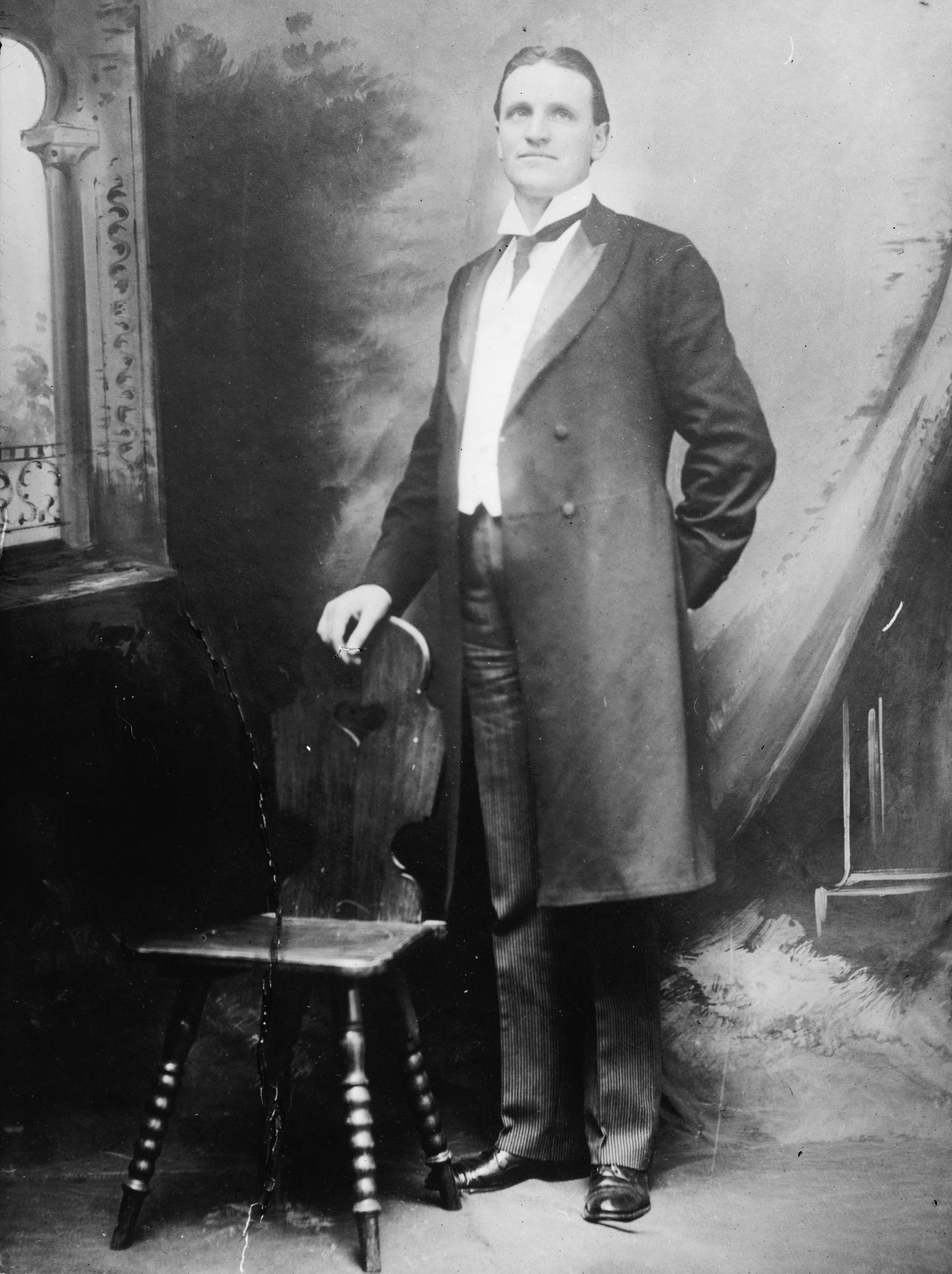
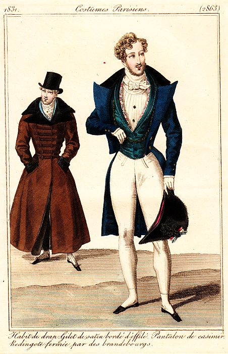
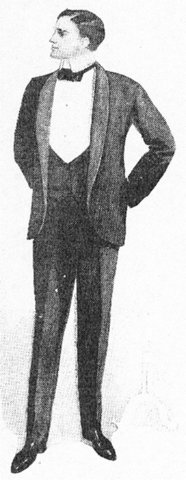
One last thing to note is the menswear's gradual march from casual to formal, which has been progressing since the early 19th century. Around 1820, men wore a frock coat (with a "skirt" down to the knees on all sides) for informal daytime events, and a tailcoat for formal daytime and evening events. By the 1860s, the sack coat (effectively our modern suit jacket) had been introduced for very casual daytime wear and the frock coat had been relegated to formal daytime status, while the tailcoat was worn only in the evenings. By the 1880s, the sack coat remained informal, while the morning coat or cutaway was accepted as semi-formal daytime attire and the frock coat was worn only for the most formal daytime occasions. Tailcoats were still worn for evenings. By the turn of the 20th century, tuxedos were added to the mix as a less-formal evening alternative (a dressy form of the sack jacket). By the 20s, American men wore sack-jacket suits for virtually everything and tuxedos or tailcoats for evenings. In this image of King George V in 1927, notice that the man at the far left wears a sack coat, the man greeting the King wears a morning coat, and the King and his friend wear frock coats (extremely stodgy and outdated at this point).
As we are now, virtually no one (but the Brits at Ascot) wears a morning suit (which is a shame, because they're very nice-looking). Only conductors wear white tie and tailcoats. We now no longer wear suits for work. So the power jeans begin to work their way into the rotation. Who knows-- we may be wearing them to gala events in 50 years!
What do you think? How do you feel about the use of power jeans? Do they work in your field, or not? Do you think they'll eventually become the new suit? Would that be good or bad (or simply fashion)?
Photo by Michael Rougier for Life, March 1955.
Wednesday, October 14, 2009
Fashion and Aspiration: Glamour's Plus-Size Models and Our Body Perceptions

In this month's Glamour Magazine is a feature on "the new definition of gorgeous," featuring seven plus-size models: Crystal Renn, Lizzie Miller, Amy Lemons, Ashley Graham, Kate Dillon, Anansa Sims, and Jennie Runk. All seven of them pose nude together (strategically covered), showing off the soft smoothness of their bodies and their ample curves. The feature seems to be a result of the dramatic response to the appearance of a nude (again, strategically covered) photo of Lizzie Miller in September's Glamour, sitting, smiling, and sporting a tummy roll. Women all over the country expressed their relief at finding a gorgeous picture of a woman in a magazine who "looked like them," curves and all. This month's article notes that this image was "just one of more than a hundred of full-figured women (they've) run in recent years, so (Glamour's editors) were surprised when it hit a nerve." Their theories? The recession has us in a "back-to-basics" mood, celebrities have recently spoken out against our less-than-perfect-body-hating fashion culture, Michelle Obama takes fashion risks, and perhaps we're finally tired of the bone-thin models we've seen everywhere for ten or so years. I agree with Glamour's editor-in-chief, Cindy Leive, that it was probably the combination of Miller's belly roll and unabashedly confident smile that did it. The photograph's statement was, "I know I have a belly roll. There it is. I haven't chosen a pose that minimizes it. I'm not hiding it. I'm still hot and feel great about my body! Check me out."
The article by Genevieve Field (which I highly encourage you to read) reveals the difficulties models have in being over a size four (and most runway models are closer to 00). First, sample sizes made for fashion photo shoots aren't made above this size (the writer mentions that designers sometimes make a one-off garment for a larger celebrity, which happened when Queen Latifah was Glamour's cover girl).
Second- and a bit of a surprise to me-, most designer fashion labels don't make sizes larger than 10 or 12, and it's not because there isn't a market for it. The article quotes Marshal Cohen, chief industry analyst for market research firm NPD, as saying "We know that larger-size women will pay almost anything for good-quality clothes that fit, and luxury brands could benefit greatly from serving that need. But there remains a deep stigma against going plus-size in the high-end fashion market. Find a brand that's willing to be its image and licensing revenue by doing this, and you will find a progressive company." So while designers know it could increase their sales to offer larger sizes, it's seen as "selling out," in a way- as becoming less fashionable and less exclusive, a stain on their brand image that might affect their prestige and sales among current customers. As it is now, not just any woman can wear Dior- you have to already bring a fashionable body shape and size to the table before you can try on--or model--the garments (that is, unless you are interested in haute couture, which is even more astronomically expensive and has a minuscule market of celebrities and heiresses).
But fashion will always be exclusive and unreasonable, and I don't think there's anything that can be done to change the fact that underweight bodies are our current fashionable ideal. Fashion is driven by novelty and dictated by excess and leisure. High fashion is only accessible to those with enough disposable income to invest in trends that will inevitably become obsolete and that demonstrate a certain level of status. A white dress that's dry-clean-only, four-inch heels that would never allow you to do any manual labor, over-the-top accessories that get in your way and serve no purpose other than decoration-- there's a reason you don't see housekeepers and waitresses wearing these things. These clothes say "I have money to spare, and it's not because I work at a menial job." Similarly, a fashionable body shape might say, "I can afford a gym membership and health food and I choose to limit my intake because maintaining my body shape is a high priority for me." When rail-thin models become unfashionable, it will simply be because the industry is tired of them and wants a new look, not because they've changed their philosophies. I'm not making any value judgments here, saying that fashion is good or bad; I'm simply stating what fashion is and always has been.
But here is where the change can, and perhaps is, happening. The article mentions "aspirational imagery," a marketing strategy that creates in the viewer a connection with a depicted look-- the consumer imagines an ideal situation created by a product they are seeing advertised. Some who commented on the Glamour article argued that the editors were inspiring women to be content with obesity or unhealthy lifestyles and encouraging them to be complacent about their bodies. But I think we, as a society, have confused "healthy" with "fashionable." Many standard models have unhealthy bodies, and these models, while "plus-size" by industry standards, are far from obese; they are actually sizes 10-14. Two of them, Crystal Renn and Kate Dillon, were previously "straight" (standard-size) models, and found success and happiness in their (now plus-size) work once they allowed their bodies to come to their natural sizes. Another, Amy Lemons, is quoted as saying, "every body has its own healthy weight--it's the one you get to by eating and exercising right, not by pushing yourself to the brink."

In my eyes, the big problem with fashion's underweight ideal body is the prevalence of aspirational images that are so far from what many healthy women look like. Almost every woman that is depicted as beautiful or stylish is also a waif, which makes women connect poise, attractiveness, and sex appeal with a very thin body. The wonderful thing about these images of normal-sized women is that they are stunningly beautiful, confident, and well-dressed. They create aspirational imagery that removes the stick-thin factor from the imaginary situation and allows female consumers to imagine themselves as stylish and attractive without having to lose ghastly amounts of weight. This is an important and healthy change, and one that I am confident that Glamour will continue (see their pledge at the end of the article).
Of course, there is still plenty of unattainability and fantasy in models. For one thing, there is still very little representation of models between sizes 4 and 10 and above size 14. Many-- most?-- of us have imperfections absent in the models we see, regardless of size-- a larger nose, stretch marks, ears that stick out, etc. That doesn't mean that we're bad and they're good-- but it does mean that we don't look like most models. That is where body image will always be a bit of a challenge, and where the importance of detaching value from the fashionable ideal is crucial in establishing our self-esteem and that of young women.
So, while I don't predict that Vogue will feature any substantial plus-size spreads in the near future, Glamour has taken an important step in relating to its target audience and helping women everywhere connect to beauty and style. Because, as Field says, "a generous helping of fantasy...is fabulous--as long as it's extended to women of all sizes."
What do you think? I am very curious to hear comments on this issue.
Read the original article here, as well as an interview with Crystal Renn here, and see a slideshow of the photo shoot here.
Photos of Marilyn Monroe and Elizabeth Taylor, plus-sized by today's modeling industry standards. Photo of Monroe by J.R. Eyerman for Life, February 1946; photo of Taylor by Peter Stackpole for Life, February 1950.
Tuesday, September 29, 2009
Christian Louboutin Re-releases "Love" Shoes

My friend and colleague Julie Ann Orsini, who co-curated the exhibit "Sole Desire: The Shoes of Christian Louboutin" with me a couple of years ago at FIT, just brought a very exciting piece of news to my attention: Louboutin has released new versions of the "Love" shoes for fall 2009!
One of our favorite pairs of Louboutins (featured in the exhibit), the love flats were designed in the 90s when Louboutin saw a picture of Princess Diana looking mournfully at her feet. He says that he thought she might smile if she were looking down at these shoes (the Net-A-Porter website says he "wanted her to always have love at her feet"). They were one of the pairs that helped launch his career (and they're even early enough to lack his now-signature red soles, which weren't introduced until later in the 1990s). They're dear, but my complaint with them has always been their rather dowdy and dated shape.
But... drumroll please... they have been revamped (pun intended) and are now for sale again! Net-a-porter carries patent-leather flats, lower-cut and rounder-toed than the originals and with gold lettering instead of beige (here). They also carry suede pumps in a beautiful, classic shape with the letters in rhinestones across the front (here). The CL stores carry black patent pumps with silver lettering, burgundy patent pumps with lilac lettering (ooh!), black flats with bone lettering, and black suede flats with red patent lettering. I have also seen them on Ebay as black pumps with red lettering. I am in LOVE with these (I know, I know)- they are timeless, classy, sweet, and feature an insider reference to his early days of designing.
Do you like them? Would you ever drop the cash? Have you seen them in person?
Which are your favorites? (I think mine are the rhinestone pumps or the black pumps with red lettering).
Photo by Walter Sanders for Life, n.d.
Wednesday, September 23, 2009
An Unusual Coat at Anderson House and Japanese Fashion at the Textile Museum

This Friday at 12:30, I'm giving a free 20-minute "Lunch Bite" presentation at the Society of the Cincinnati Museum at Anderson House on Massachusetts Ave., where I recently completed an internship. I'm going to focus on an object in their collection, a coat belonging to an original member of the Society that dates from around the turn of the 19th century. It's very unusual in its materials and construction and has led me down an interesting path, on which I'll elaborate more in my talk. I'll also put the coat in context and talk a little bit about men's summer clothing around this time period.

There are some very interesting things happening at the Textile Museum, just around the corner from Anderson House on S street. I've interned there in the past as well, and I'm a huge fan of this museum. Their Textile Learning Center, on the second floor, has a lot of hands-on features that explore the basics of textiles. Currently on exhibit is a group of their recent acquisitions, and opening in October is an exhibit of contemporary Japanese fashion from the collection of Mary Baskett, focusing on seminal designers Issey Miyake, Rei Kawakubo (of Comme des Garçons) and Yohji Yamamoto. These three designers have been at the head of avant-garde fashion design for the past thirty years and continue to revolutionize the field.
This brings me to a very exciting event taking place from October 16 through 18: the Textile Museum's Fall symposium, titled "From Kimono to Couture: The Evolution of Japanese Fashion." I know I sound like a radio ad for the Museum's fall events calendar, but I think that this symposium is going to be a great commentary of research, analysis, and commentary from some very eminent scholars in the field. Harold Koda, the Curator in Charge at the Met's Costume Institute, is presenting, as well as Sharon Takeda, Senior Curato and Head of the Costume and Textile Department at LACMA (the LA County Museum of Art, which has an excellent collection and great online database). At the end of the Sunday session is a "show-and-tell" of Japanese textiles, where participants can bring in a textile from their collection, which I think is a nice idea to get those who aren't presenting to be involved in the program.
It is a rather expensive event- if you register before October 2nd, it's $220 for Museum members and $265 for non-members, and $180 for students. Being underemployed and no longer a student, I will probably have to live vicariously thorough my colleagues at the Museum, but I would highly recommend that you attend if you can! Complete information is available here.
First photograph by Al Fenn, 1952, Life. Second photograph by Michael Rougier, Life.
Tuesday, September 8, 2009
Report from NYC: "Fashion and Politics"

The third exhibit we saw in New York a few weeks ago was also at the Museum at FIT- "Fashion and Politics." The museum maintains a permanent exhibition on the history of fashion in their museum gallery, whose contents and theme change about every six months. Previous rotations have focused on subjects such as garment construction ("The Tailor's Art"), color ("She's Like a Rainbow"), and exoticism ("Exoticism," appropriately). This choice of subject was obviously a timely one, and connects well to Michelle Obama's inaugural ensemble shown downstairs in the Isabel Toledo exhibit (although I didn't note any indications to the visitor connecting the two exhibits).

The museum's extensive collection boasts some relevant and interesting examples of political fashion, including an "I like Ike" dress, and RFK scarf designed by Oscar de la Renta, and--my favorite-- an anti-prohibition handkerchief that reads "More Beer Less Taxes."*
For each history gallery rotation, there are two narratives--one, the development of western fashion from the 18th century through the present day, and two, the rotation's particular focus. The problem with this rotation was that while fashion and politics have intersected for a long time, there are times when it is difficult to find garments or accessories that are overtly political. There were some obvious gaps in the show, especially in the 18th and 19th century sections as well as in parts of the 20th century. The curators dealt with this by incorporating pieces with associations to a particular social movement or group, such as the late-19th-century Aesthetic movement or the mid-20th-century middle class.
This was a bit iffy to me. The definition of "politics" can certainly be broad, but I felt it was stretched in some areas and not in others without a strong overarching cohesion to the whole show. The Aesthetic movement certainly had an impact on fashion and art, and was widely lampooned in the press, but its agenda was entirely nongovernmental, as far as I know. Similarly, while the middle class certainly became a formidable socio-cultural entity during the middle of the 20th century, the exhibit didn't clearly link it to particular political movements in a meaningful way.
So while this was an enjoyable, digestible exhibit, and the garments and accessories were nicely displayed, I felt that the Museum was pushing the show's thematic boundaries to fill holes between its strongest objects. Perhaps if the exhibit text had made mention of the broad definition of "politics" and more clearly connected certain pieces to the theme, the exhibit would have felt a bit stronger.What do you think? Has anyone seen the exhibit? How would you deal with the issue of objects that connects to an exhibit's theme in a less-than-obvious way? What do you consider "political" fashion?
The exhibit is up through November 7th. For more information, look here.
All photographs by Nina Leen for Life, April 1952. *I can excuse their grammar this time.
Monday, August 24, 2009
Report from NYC: "Isabel Toledo: Fashion from the Inside Out"

While we were in NYC, my husband and I stopped in at my old stomping grounds, the Museum at FIT, to see two interesting exhibits. Today's post focuses on what was by far our favorite exhibit of the weekend: "Isabel Toledo: Fashion from the Inside Out."
While Isabel Toledo has recently come into the public eye because of the coat and dress set she designed for Michelle Obama to wear at this year's inauguration ceremony, her work has been exhibited at FIT for years, and her husband Ruben, a noted illustrator, designed the "spinning wheel of fashion" motif used in the Museum at FIT's permanent history gallery.
Specifics of the exhibit, as well as more details about Toledo herself, can be found at the online exhibition webpage here. What I'd like to focus on is why this was the consummate Good Fashion Exhibit, enjoyable both to me and to my "layman" husband.
The exhibit took place in the Museum's downstairs galleries, a large, square, versatile space with a sort of lobby area usually used for an introductory section. The lobby section featured Michelle Obama's inaugural ensemble as well as an opening didactic panel and a wraparound timeline of Toledo's work. The first didactic introduced Toledo and also gave an overview of the structure of the exhibit, telling the visitor what the thematic sections were and how they were arranged. This was one of my favorite elements of the exhibit's text, because it let the visitor know exactly what to expect and helped them orient themselves within the exhibit, so they would never be wondering whether they had missed a section or if they were progressing along the correct path.
Speaking of which, another aspect of the exhibit that I enjoyed was its layout: each corner of the large, square space past the lobby featured a thematic area focusing on one element of Toledo's design. They did not have to be viewed in order, so visitors entering from either side of the space would have an equally coherent experience. There was a central circular area that featured a variety of Toledo's works, arranged to loosely correspond with the thematic section they were facing. This allowed the visitor to easily transition from section to section and see how all of the themes tied together.
Within the sections, didactic text was informative but brief, accessible without being simplistic; my husband read it all and understood each section and its connection to the overall exhibit. In addition, the didactics made reference to specific garments being shown, connecting the thematic ideas to the pieces in concrete ways. Many of the object labels also had silhouettes of the flat patterns of the piece being displayed, allowing the visitor to get a sense of how Toledo sculpts with fabric and turns 2 dimensions into 3 in innovative ways. There were a few garments that were mounted flat in order to display their unique shapes when off the body. The exhibit also featured some of Ruben's illustrations of Isabel's pieces, which were a great complement to the garments.
My only-- and small--gripe was that the mannequins weren't absolutely my favorite- their faces were a little stylized and they had built-in wedge feet, which was a little odd- but frankly, they allowed plenty of attention to be given to the garments and acted as proper bodies underneath them, which is all you can really ask for from a mannequin!
My husband raved about the exhibit when we left, which says a lot considering he knew nothing about Toledo going in and we had already done one fashion exhibit that morning ("The Model as Muse").
This was an A++ exhibit! Kudos to Valerie Steele, Patricia Mears, and the staff at the Museum at FIT.
Has anyone else seen it? How did you feel about the exhibit? What elements are most important to you in a fashion exhibit?
"Isabel Toledo: Fashion from the Inside Out" is up at the Museum at FIT until September 26.
Photo by Master Sgt. Cecilio Ricardo, USAF, January 20, 2009.
Monday, August 10, 2009
Report from NYC: "The Model as Muse"

I have been terribly delinquent in posting recently, since I've been so busy I've had to resort to Chef Boyardee at home (but that's another story). My hope is to now make up for it with some good posts!
This weekend I went up to New York City to see some great fashion exhibits. My brave and patient husband accompanied me, and was able to give me commentary from the viewpoint of a fashion and museum "layperson." The first exhibit we went to see was "The Model as Muse: Embodying Fashion" at the Metropolitan Museum of Art, which closed on Sunday. I blogged about this a while ago in the context of the "sexy" exhibit (here) and I wasn't sure what to expect, thinking perhaps it might kowtow to popular celebrity supermodel obsession.
My fears were unfounded. I thought the exhibit was not only enjoyable and well-designed, but highly academic! I would identify the show's "big idea" as "models have played a vital role in the world of fashion since the 1950s, and that role has changed fundamentally in each decade." Each section of the exhibit examined approximately one decade, explaining the fashion milieu of that time period, exploring the role of the model (sometimes the different roles of different types of models, such as the house or "cabine" models and the magazine models) in that milieu, and highlighting a number of important models and their contributions to the history of fashion design and merchandising. Each room set the stage for the time period in design and mood, using music ("C'est Si Bon" for the 50s, "My Generation" for the 60s, "Smells Like Teen Spirit" for the 90s, etc.) and video clips, usually from fashion-centric movies.
This show faced a major challenge in that it used garments on anonymous, identical mannequins to convey ideas about very distinctive individuals whose appearance and particular way of wearing clothes had a lasting influence on designers, artists, media, and the public. The curators used fashion photography, magazine spreads, and videos to make sure that the models themselves were the exhibit's central focus, while the clothing on mannequins served to reinforce the design side of the equation. The first room re-created a magazine spread of Charles James dresses worn by famous models in a nineteenth-century-esque drawing room scene, putting James dresses from the Costume Institute collection on mannequins in poses similar to those of the original photograph, which was shown behind the mannequins. There was even a cameo appearance of some rococo furniture from the museum's collection as set pieces. Other rooms used a similar method, showing clothing famously worn by models and re-creating iconic scenes. A few conceptual garments really captured the interplay between model and designer: a spread of dresses by John Galliano for Dior that created the look of a Stockman dress form with an evening gown being built upon it, each named for one of Dior's famous cabine models, and two dresses at the very end of the show that were part of a collection by Marc Jacobs for Louis Vuitton, in which the models were masked and wore sheer lab-style coats over their garments, creating a sort of homogenous anonymity.
There were a few flaws with the exhibit. I wasn't crazy about the very stylized mannequins, nor the hair and makeup that had been applied- it worked okay in certain areas, but it was terribly distracting in others (the 1950s room, for instance). The sound clips could have been a little longer so you didn't hear them over and over again when you were going through each room. I wish the Dior dress at the very beginning, in the recreation of "Dovima with the Elephants," wasn't touching the raffia on the ground (mylar please!).
There were some things I really loved- the light fixtures that looked like photo shoot lights, the fact that most of the photos were given space to speak for themselves, the layout and trajectory of the exhibit.
And there was one thing that I both loved and really didn't like: the text. It was beautifully and profoundly written, academic but engaging, almost poetic at times. It really tied the curators' ideas together and provided the conceptual starting point for all the objects in the exhibit.
But there was a LOT of it. Even I, who almost religiously reads every word of didactic text, got tired of reading. My husband commented that while he enjoyed the exhibit, everything he learned from it came from my explanations, because he attempted to read the didactic panels but quickly fell into TLDR (too long, didn't read) mode. The text was crucial to a real understanding of the exhibit's narrative, and yet it was inaccessible to anyone who wasn't willing to put in the time and mental energy to follow.
So the target audience of the exhibit was people like me, which is legitimate- not every exhibit has to be made for multigenerational families, the general public, etc. The Met's visiting public, however, is a broad group composed of a whole lot of tourists and a whole lot of art enthusiasts, and any fashion exhibit is likely to have a big draw for those who don't necessarily have a background in the subject. I wonder if the exhibit might have been more educational if the text had been pared down, and those of us who wanted to delve deeper could have read more in a brochure (which they didn't have) or the catalog.
Overall, B++ exhibit. Enjoyable, educational, relevant to the field- but perhaps it could have been tweaked to be more accessible without compromising too much of its content.
Did any of you see the exhibit? What did you think? How do you feel about didactic text and the balance between depth and readability?
Magazine photo of Naomi Campbell by Brigitte Lacombe, Time Europe 9-18-1991.
Subscribe to:
Posts (Atom)